One of the most common design mistakes in hardwood floor refinishing is choosing a stain color in isolation picking a color chip at a showroom without seeing how it will interact with the wall paint that surrounds it every day. The result is often a room that feels slightly off without the homeowner being able to identify why. The floor and walls are not fighting each other exactly they just are not working together either.
Getting the stain-to-wall relationship right is not complicated, but it requires understanding a few fundamentals about undertones, contrast, and how wood species affect the final color. We work with homeowners across Monmouth County, Ocean County, and Middlesex County, NJ on stain selection regularly, and the guidance in this article reflects what we see working consistently in real New Jersey homes.
Start With the Floor, Not the Walls
When both the floors and walls are open to change, most designers will tell you to decide on the floor first. There are practical and aesthetic reasons for this. Floors are a larger, more expensive, and harder-to-change investment refinishing takes days and costs significantly more than repainting. Wall paint can be changed in a weekend for a fraction of the cost.
Starting with the floor also means starting with the most constrained element of the design. Your wood species limits which stain colors will look their best. Red oak, for example, has warm pink undertones that will show through any stain applied to it a cool gray stain on red oak will read as slightly purple in many lighting conditions. White oak, by contrast, accepts cool and neutral stains far more evenly. Knowing your species first tells you which direction the stain can realistically go, which then tells you where the wall color needs to land.
If you are choosing both new floors and new wall paint a full renovation rather than just a refinish select the floor species and stain family first, get test patches on the actual floor, and then bring those samples to the paint store when choosing wall colors. This sequence produces far more cohesive results than working in the opposite direction.
Understanding Undertones in Stain and Paint
Undertone is the hidden color beneath the dominant surface color. Every paint and every wood stain has one. A gray paint can have blue undertones, purple undertones, or green undertones and a wood stain can have orange undertones, red undertones, or yellow undertones. When the undertones of floor and wall conflict, the room feels unresolved even if the individual colors look fine in isolation.
The fundamental rule for coordinating floor stain and wall paint: keep the undertones in the same temperature family. Warm stains (amber, honey, golden oak, walnut brown) need warm or neutral wall colors. Cool stains (gray, ash, Scandinavian white-gray, fumed oak) need cool or neutral wall colors. Pairing a warm amber floor with a blue-gray wall creates a friction that most people feel even if they cannot articulate it.
Warm vs. Cool: Quick Reference
- Warm stains: Golden oak, honey, amber, pecan, provincial, jacobean, dark walnut
- Cool stains: Whitewash, ash gray, Scandinavian gray, driftwood, fumed white oak
- Neutral stains: Natural, early American, classic gray (leans slightly cool on white oak)
- Warm paint families: Creams, warm whites, beiges, greiges with yellow or red undertones
- Cool paint families: True whites, blue-grays, greens, cool greiges with blue or purple undertones
Neutral undertones are the most versatile and forgiving. True neutral grays on the wall and natural or minimally stained floors is a combination that almost always reads as clean and intentional it is no coincidence that this pairing dominates high-end Monmouth County interior design. When in doubt, go neutral with both, then bring warmth through furniture, textiles, and fixtures.
Contrast vs. Harmony: Two Design Strategies
Beyond temperature, there are two broad strategies for the floor-to-wall relationship: contrast and harmony. Neither is right or wrong they create different effects, and your choice should be based on the room's size, light level, and the mood you want to create.
The contrast strategy
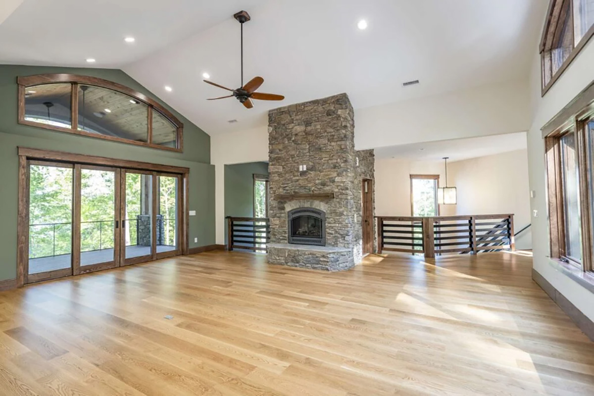
High contrast dark floors against light walls, or light floors against dark walls creates visual definition and drama. The floor reads as a distinct plane separate from the walls, which makes the room feel taller and more architecturally defined. This is the dominant approach in transitional and contemporary Monmouth County homes, particularly in living rooms and open-plan spaces where natural light is abundant.
The most popular NJ contrast combination right now: light walls (warm white or off-white) against medium-to-dark natural or wire-brushed oak in a natural or lightly pigmented finish. The floor and walls are clearly different, the undertones align, and the result reads as intentional without being dramatic.
Very dark floors (espresso, ebony, dark walnut) against very light walls creates the highest contrast and works beautifully in large, well-lit rooms. In smaller or darker spaces like a Colts Neck colonial's formal dining room with limited natural light this pairing can feel heavy. Medium contrast is usually safer in those conditions.
The harmony strategy
Low contrast floor and wall colors close to each other in value creates a softer, more enveloping, cocoon-like effect. A warm honey floor with warm cream or tan walls feels cohesive and inviting. This is a good strategy for bedrooms, studies, and rooms where comfort is the priority over architectural drama.
The risk with low contrast is a flat appearance particularly in photographs and in rooms with average lighting. If you choose a harmony approach, the distinction between floor and wall needs to be maintained through texture or sheen difference (matte walls against a satin floor finish) rather than relying on color alone.
Refinishing and changing your stain color?
We apply test patches on your actual floors under your home's lighting so you see the true color before committing. Serving all of Monmouth County, Ocean County, and Middlesex County, NJ.
Matching to Existing Wall Colors
Most homeowners approaching a refinishing project are not repainting they are choosing a new stain color that needs to work with wall colors already in place. This is the more constrained version of the problem, and it requires reading what your walls are actually doing before committing to a stain direction.
The first step is identifying your wall paint's undertone. The easiest way to do this is to hold a sample of the paint next to a sheet of pure white paper in natural light. Is the paint warm (yellow, red, orange cast) or cool (blue, green, purple cast)? This tells you the temperature family your stain needs to stay in.
The second step is assessing your current floor's species because the species constrains the stain options. If you have red oak and your walls are cool gray, achieving a clean gray stain without a pink or purple cast on the floor requires a specific formulation or a base-coat approach. It is doable, but it needs to be discussed with your contractor before you finalize the color direction. At Gorsegner Brothers, we have done enough Red Bank and Ocean County coastal-home projects to know which stain-species combinations require extra attention.
"The stain chip never tells the full story. The color you see on paper changes when it goes down on your specific wood, under your specific lighting. A test patch is the only reliable way to preview what you are committing to."
Popular Stain-to-Paint Pairings in NJ Homes
After decades of refinishing homes throughout New Jersey, certain stain-to-wall combinations have proven consistently successful across a wide range of home styles. These are the pairings we see working most reliably in Monmouth County, Ocean County, and Middlesex County homes today.
Natural white oak + warm white walls
The most widely applicable combination in current NJ design. Natural white oak minimal stain, letting the wood's inherent cool-neutral tone speak pairs with warm whites like Benjamin Moore White Dove or Sherwin-Williams Alabaster to create a balanced, timeless interior. The floor and wall are close in value but distinct in character. Works in traditional, transitional, and contemporary homes equally well.
Classic gray or ash gray + greige walls
A cool-toned stain (Bona's Classic Gray or similar) on white oak paired with a warm greige wall creates a sophisticated tension the floor reads cool, the wall reads warm, but both are so close to neutral that they coexist comfortably. This combination has been especially popular in open-plan living areas across Monmouth County where the floor flows through multiple rooms with different lighting conditions.
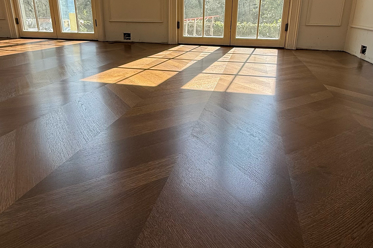
Dark walnut + white or off-white walls
The maximum-contrast approach. A deep walnut or jacobean stain against crisp white walls creates a sharp, modern look. Best in high-ceilinged or well-lit spaces. In narrower hallways or lower-ceiling rooms, the dark floor can feel heavy medium walnut is a safer choice in those contexts.
Provincial or golden oak + warm cream or tan walls
The classic warm-harmony pairing. Provincial or golden oak stain on red or white oak with warm cream, tan, or light caramel walls creates the "traditional NJ colonial" look that has been dominant for decades and remains popular in Ocean County communities with traditional home stock. The combination reads as cohesive and warm; the floor and wall feel like they belong together.
Before finalizing any stain direction, see our hardwood floor species guide for a more detailed look at how different species accept specific stain families. And once your floors are refinished, our hardwood floor care guide covers how to maintain the new look for years.
Not sure which stain direction is right for your home?
We bring stain samples to your home and apply test patches on your actual wood so you can see the real color under your lighting before committing.
Frequently Asked Questions
Should floor stain match wall color?
No matching floor stain directly to wall color typically produces a flat, undifferentiated look that makes the room feel smaller and less defined. The goal is coordination, not matching. Floor stain and wall paint should share undertones (both cool or both warm) while maintaining enough contrast in value to define the floor plane visually. The floor and wall are two different surfaces doing different jobs; they should look related, not identical.
What stain colors go with gray walls?
Gray walls pair best with cool-toned or natural floor stains Scandinavian white-gray, natural white oak, ash gray, driftwood, and wire-brushed natural tones all work well. Warm honey or amber stains clash with gray walls because the temperature undertones conflict. If you have gray walls and warm existing floors in your NJ home, a refinish to a cooler or neutral stain creates much better harmony. White oak is the preferred species for achieving these cool tones cleanly.
What stain goes with white walls?
White walls are the most forgiving backdrop for hardwood floor stain virtually any color works because white is neutral. The most popular combination in New Jersey right now is white or warm-white walls with natural or light-medium oak in a warm to neutral tone. White walls with very dark espresso or ebony floors also work well across Monmouth County and Ocean County, as the high contrast creates a dramatic, high-design effect in well-lit spaces.
Can I change my floor stain color without replacing the floors?
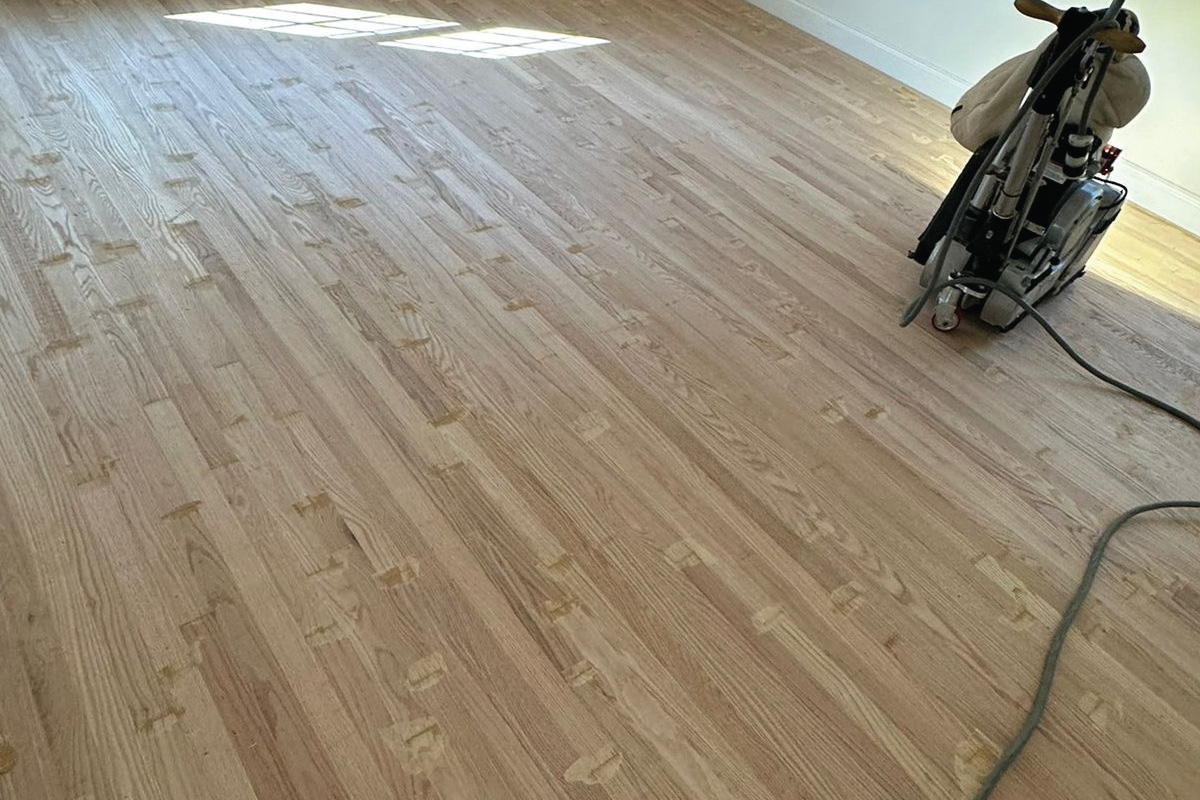
Yes as long as you have solid hardwood or engineered hardwood with a refinishable wear layer. Full sanding removes the existing stain and topcoat, after which any new stain color can be applied to the bare wood. The species of your existing floor determines which stain colors will look their best. Some species accept certain tones more evenly than others this is a conversation worth having with your contractor before finalizing the color direction.
How do I test a stain color before committing?
The most reliable method is a test patch on your actual floor after sanding not a chip sample or a showroom photo. We apply small patches of two or three candidate stain colors to an inconspicuous area and let them dry under your home's lighting conditions. This lets you see the true color on your specific wood species before committing to the full floor. Lighting particularly the difference between morning natural light, afternoon sun, and evening artificial light can shift a stain's apparent color significantly. We do test patches on every stained refinishing project throughout Monmouth County, Ocean County, and Middlesex County, NJ.